
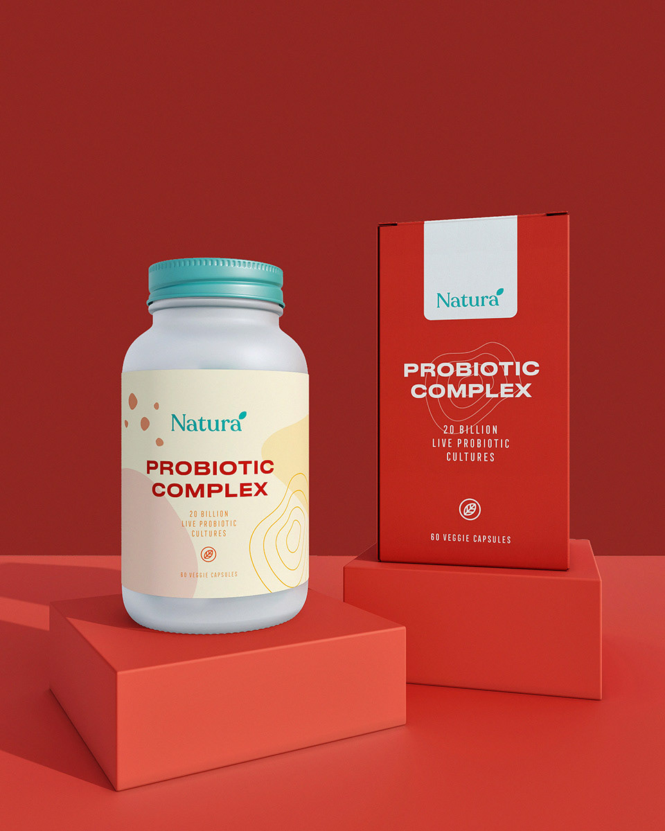
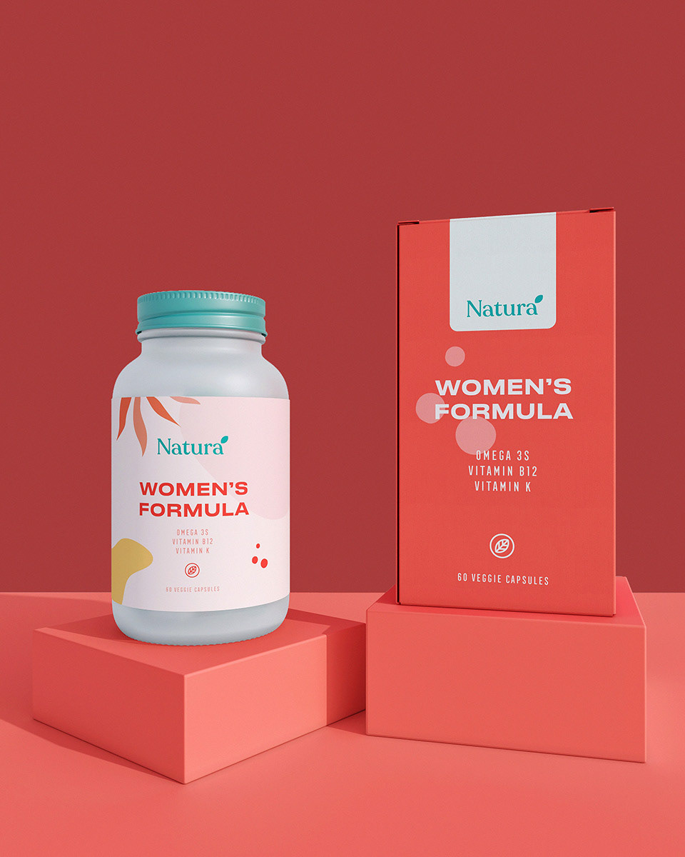
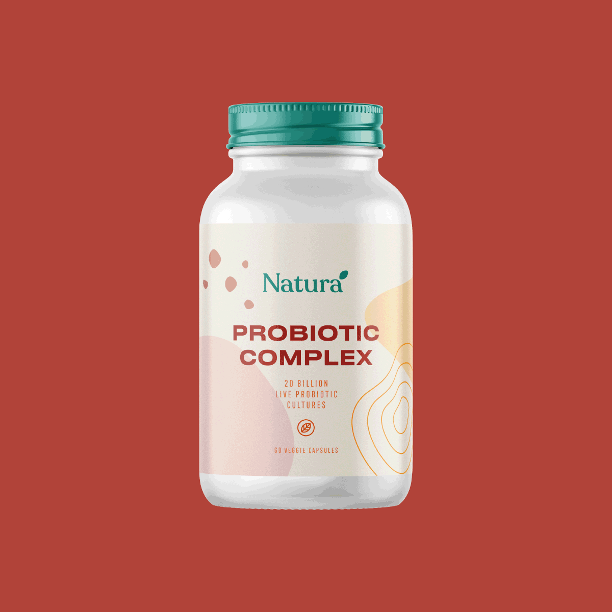
We created a brand identity with a modern and minimal approach for Natura. We provided the communication with the simple designs that the brand targets. We preferred soft tones as a color scale. We also would like to emphasize the effect of the brand with the typefaces. We would like to give an impression; personalized feeling. Natura is a minimal and contemporary project. The result is consistent packaging with a wink of elegance.
We hope that you like it!


I like this weblog it’s a master piece! Glad I found this ohttps://69v.topn google.Money from blog
Thank you for your sharing. I am worried that I lack creative ideas. It is your article that makes me full of hope. Thank you. But, I have a question, can you help me?
Your point of view caught my eye and was very interesting. Thanks. I have a question for you.
Thank you for your sharing. I am worried that I lack creative ideas. It is your article that makes me full of hope. Thank you. But, I have a question, can you help me?
Thanks for sharing. I read many of your blog posts, cool, your blog is very good.
Can you be more specific about the content of your article? After reading it, I still have some doubts. Hope you can help me.